FAST PARK TESTING & SITE OPTIMIZATIONS
Small, continuous updates drive big results.
ROLES
Sole Designer
KEY RESPONSIBILITIES
Research & Testing Strategy
UI & Interaction Design
QA
TOOLS
Lucky Orange
Adobe XD
ClickUp
THE CHALLENGE & PROCESS
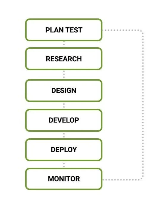
In collaboration with an analytics partner, I helped optimize Fast Park’s site through small yet effective optimizations – meeting both business goals and user needs.
As my team member monitored and recommended SEO and Paid Search opportunities, I helped design a series of split tests and UX optimizations based on their findings.
This ensured that no ad dollars were wasted, and users could make reservations with ease and confidence.

TEST 1
Reservation Page Optimizations
THE PROBLEM
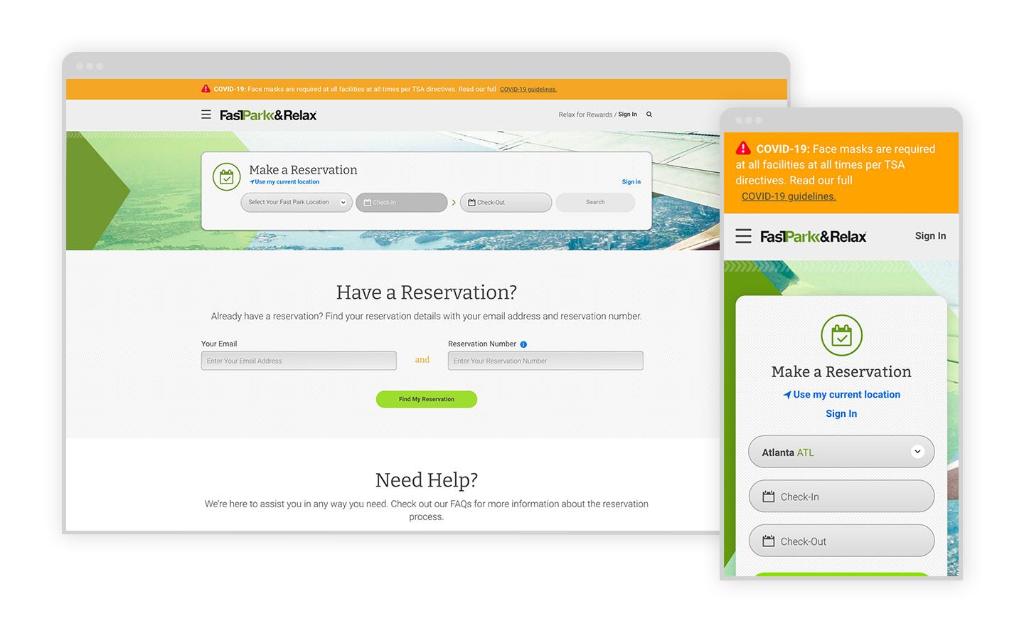
Monitoring discovered that conversion rates for reservations were significantly lower on desktop than mobile.
After watching recordings of user behaviors, we discovered a pattern. On desktop, several users were using the second “Have a Reservation?” module. On mobile, we also discovered that users were having an issue with selecting check-out dates.
THE RESEARCH
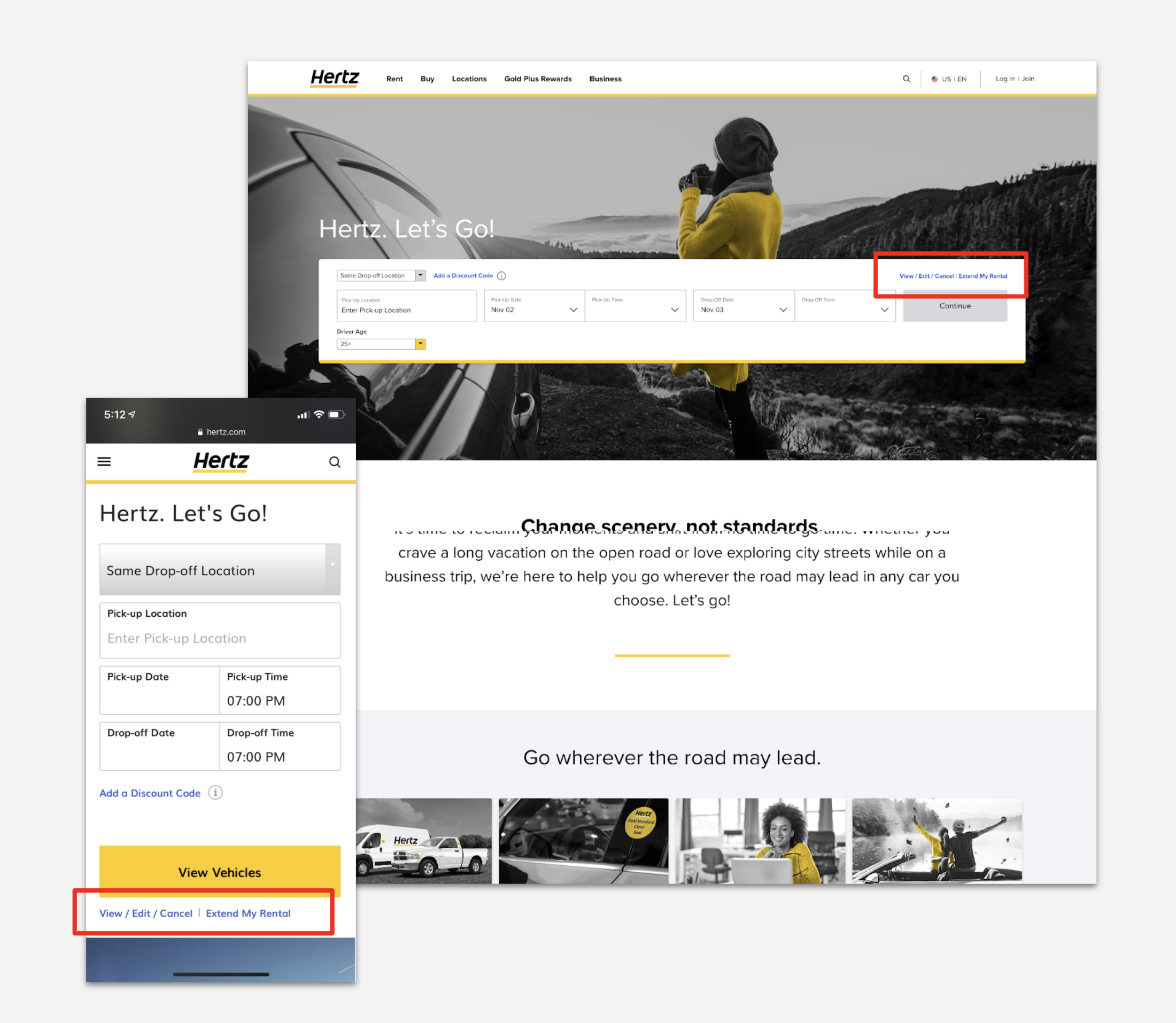
Though Fast Park is a leader in the discount parking category, indirect competitor research provided some inspiration for a simple solve.
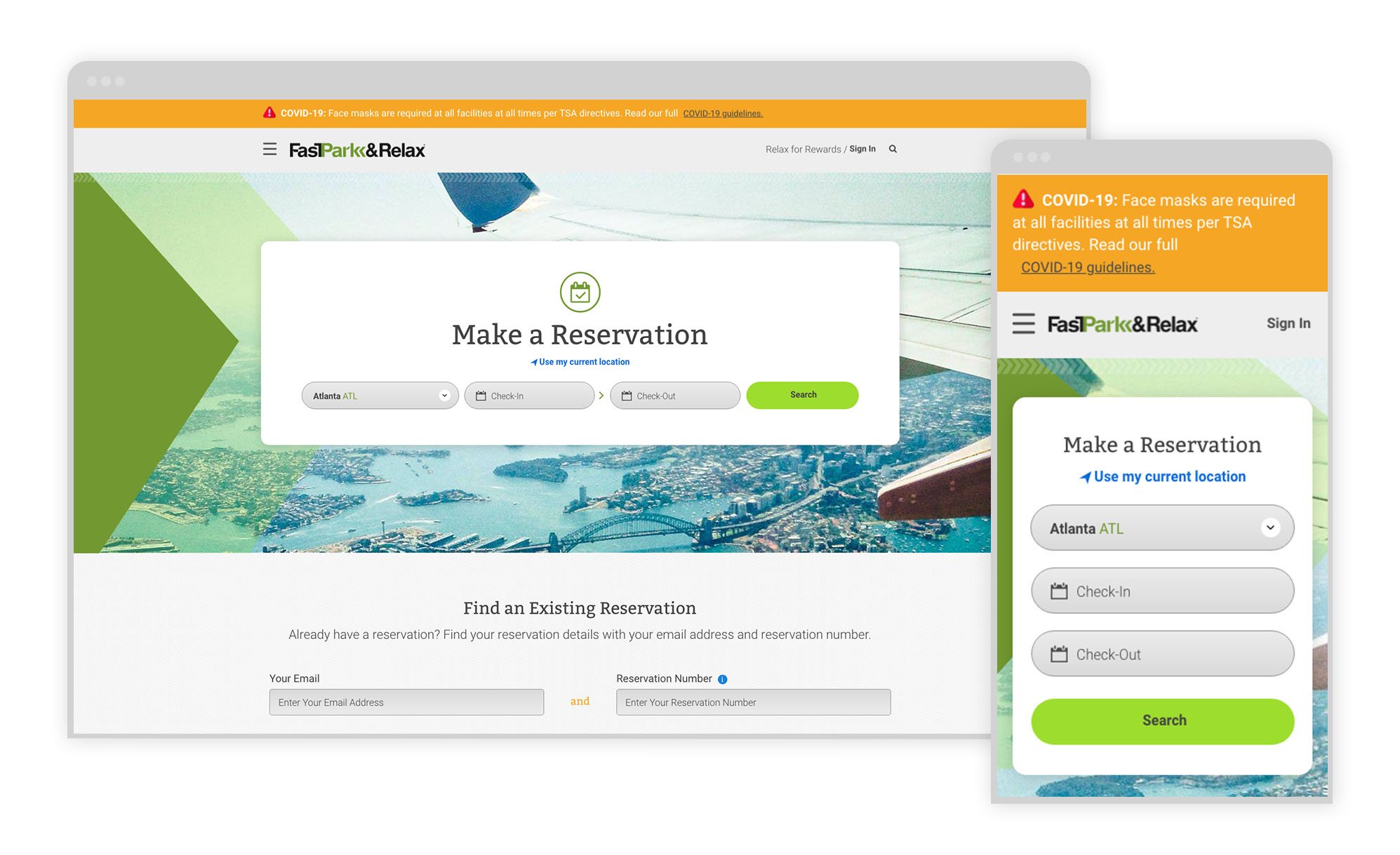
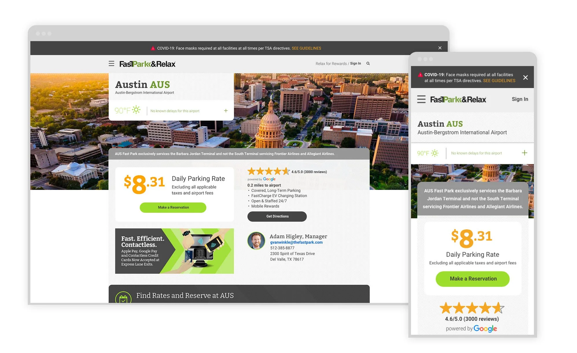
Give the “Make a Reservation” module much more real estate on desktop. Condense the mobile experience by removing imagery that may be inhibiting core reservation functionality.
THE RECOMMENDATION
Though the reservations page could use several improvements, finding the balance between business and user goals is always important. I created a range of options of varying degrees of personalization and level of effort.
Ultimately, we rolled out the update with the lowest level of effort. Our hypotheses was that the simple change would offer highest return on investment.
The results are still being monitored, but we are already seeing significant improvements in reservations made with a recommendation that took less than a week to kick off and implement.
Simple visual updates have already yielded significant ROI.

TEST 2
Live Chat Functionality Optimizations
THE PROBLEM
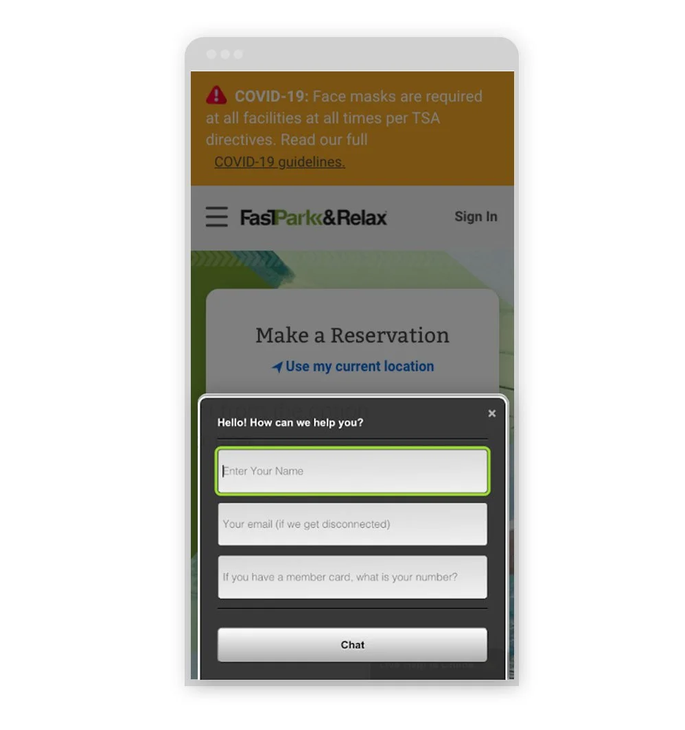
Monitoring discovered that only half of users that click on the live chat function actually start a session.
After watching recordings of user behaviors and taking a look at the user flow, we were able to apply best practices to solve the problem.
THE RECOMMENDATION
Asking the user for their personal information when they were already frustrated or confused by an experience was likely the reason for users bouncing from the live chat functionality.
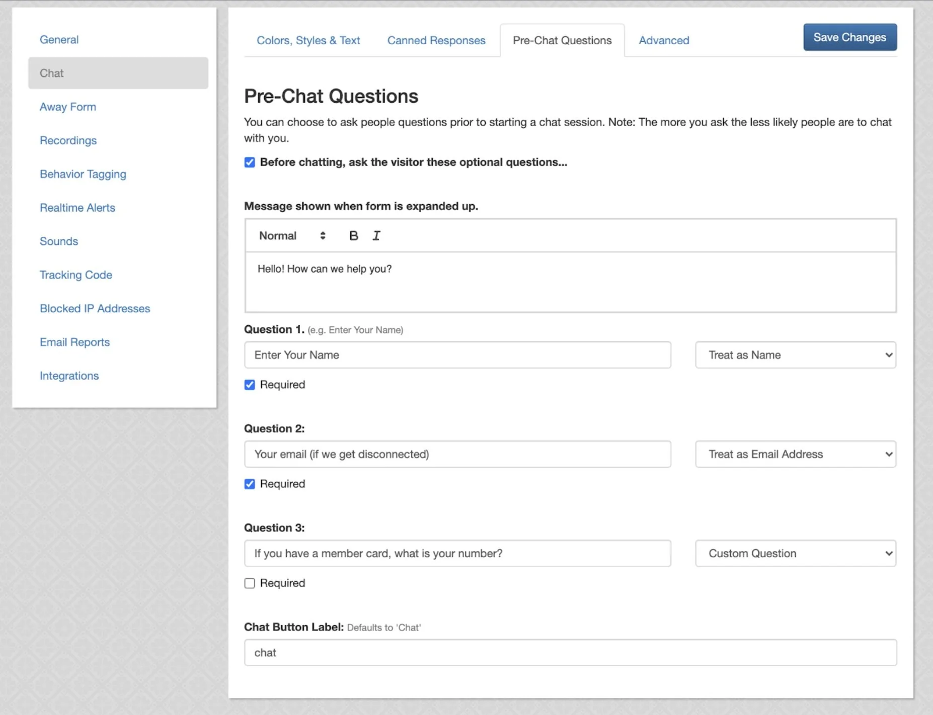
I investigated the out of the box features of the live chat tool to see what could be easily changed and understand my constraints.
Ultimately, I recommended 3 things:
Make the first impression less intimidating by removing form fields for personal information up front.
Instill confidence in the first message by giving hints of what kinds of answers the live chat function can help provide.
Better explain why personal information is needed in context to the user’s goal. (e.g. will help pull your reservation more quickly)
Simple changes to the user flow and removing the barrier of a seemingly gated experience has resulted in increased usage of the Live Chat feature.

TEST 3
Ratings & Reviews Integration
THE PROBLEM
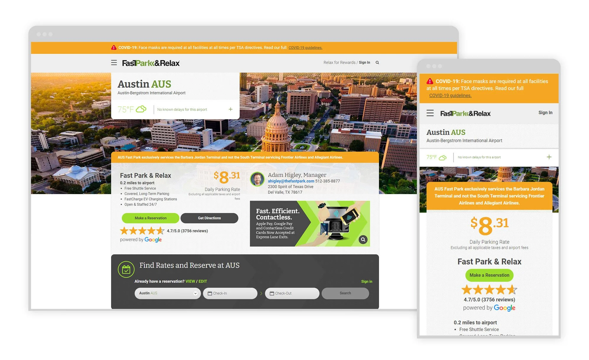
A previous test suggested that when the size of ratings on mobile was increased, performance improved. Increase in size had no noticeable effect on desktop performance.
Our hypothesis was that visual clutter in the desktop experience may be obscuring the star ratings, while the prominence in stars is well established in mobile.
THE RECOMMENDATION
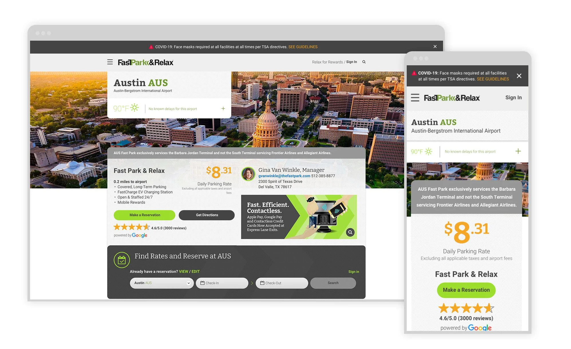
I created a series of solutions for testing that explored different opportunities to solve for the visual clutter. Each recommendation considered changes to the desktop experience without sacrificing the positive improvements of mobile from the previous test.
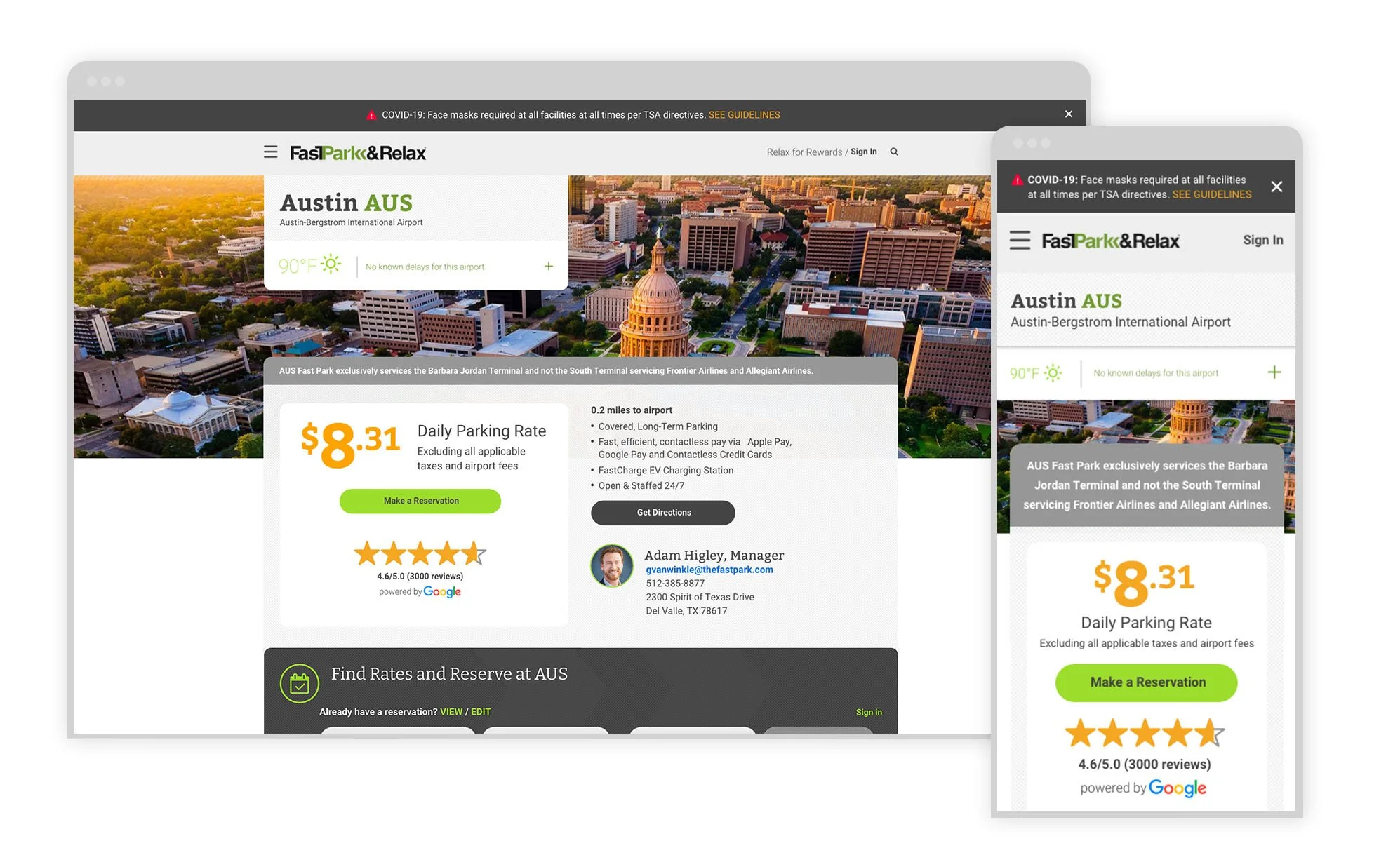
Hypothesis 1: Color updates to surrounding UI allow yellow of stars to contrast in desktop, bringing attention to the star rating.
Hypothesis 2: Updating layout to allow stars to live higher on page will bring more attention to the star rating.
Hypothesis 3: Simplifying content in addition to color and layout will bring more attention to the star rating.
THE RESULTS
After split testing the different layouts, we did discover that the higher placement of the star ratings made a huge improvement in conversions.
Next Case Studies
RESEARCH • WIREFRAMES • WEB DESIGN • PROTOTYPE
Simplifying the discovery and purchase of thousands of lab equipment products.
WORKSHOP • IDEATION • APP DESIGN • PROTOTYPE
Visionary DE&I solution for an agency network.
AGILE PROCESS • RESEARCH • STRATEGY • WIREFRAMES • WEB DESIGN
Bringing awareness to a new standard of health & safety.
