TISCH SCIENTIFIC PRODUCT PAGE REDESIGN
Simplifying the discovery and purchase of thousands of lab equipment products.
ROLE
Sole Designer, Content Strategy
KEY SKILLS
Site Audit
Competitive Research
Wireframing
Prototyping
UI & Interaction Design
TOOLS
Miro
Pencil/Paper
Adobe XD
Jira
THE CHALLENGE
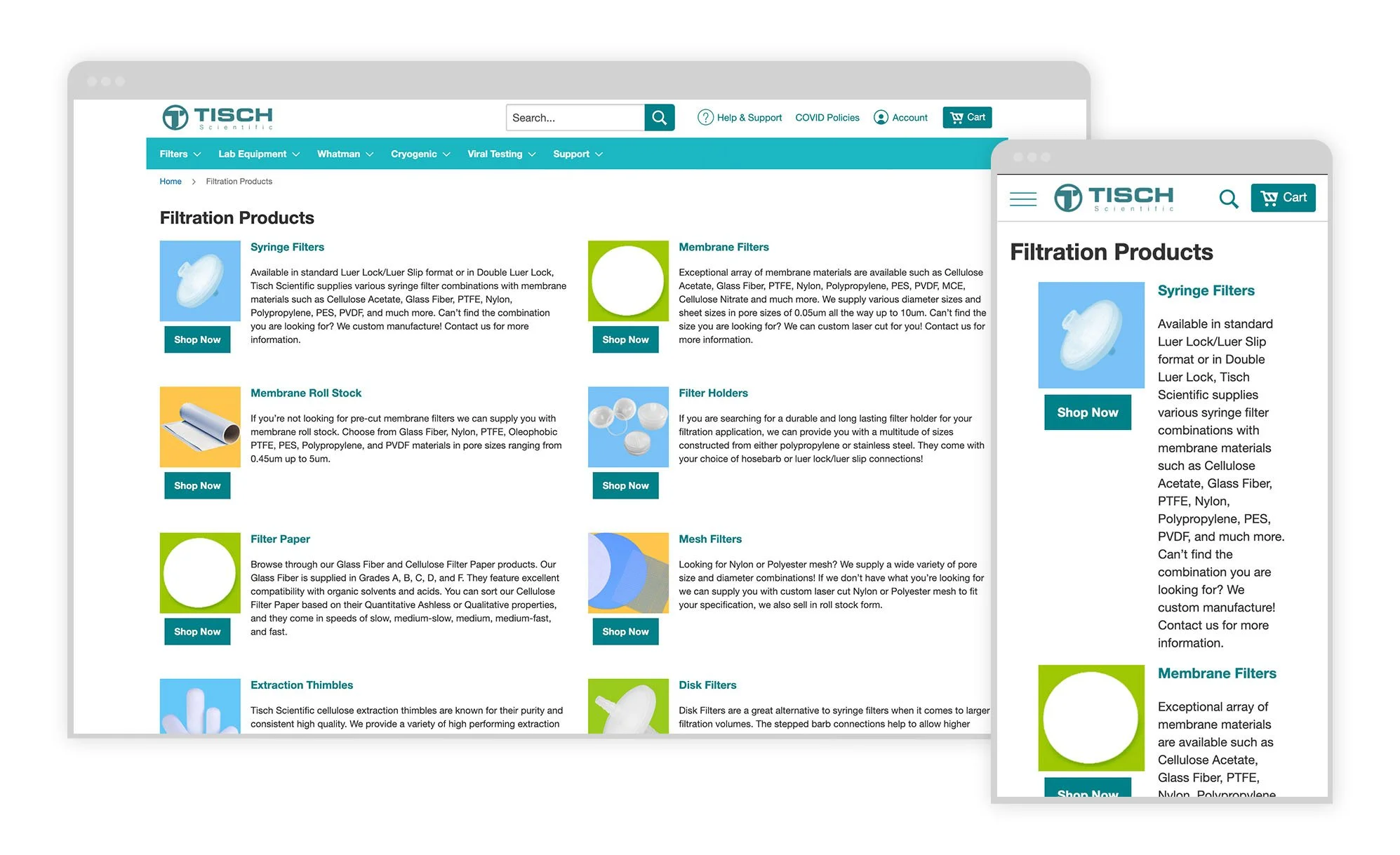
Tisch Scientific offers brand-name and private-label lab equipment. Currently, the experience serves as a catalog of all the products, but does not successfully meet lab techs seeking to find specific products or discover new ones.

How might we help lab techs more easily find the specific products they need and increase awareness of the full product offerings?
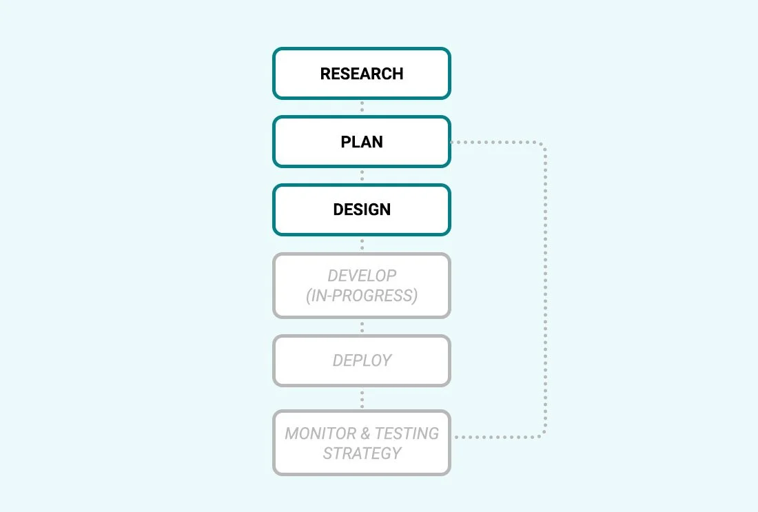
THE PROCESS
Collaborating with a web analytics specialist, we found that Tisch Scientific’s PTFE Filters product category page is one of the highest-trafficked pages on their site. As an ongoing effort to optimize the existing site experience, we looked to past user research interviews to see how we might further improve the experience to maximize on the value of site traffic.
THE RESEARCH
Based on previous user research, prioritization of complex information was key to optimization.
The most important things to lab techs and managers, ranked:
Product in stock, ready to ship
Fast delivery
Free shipping (one person said they simply won’t order from a vendor unless the shipping is free)
Pricing was noted as the least important of these
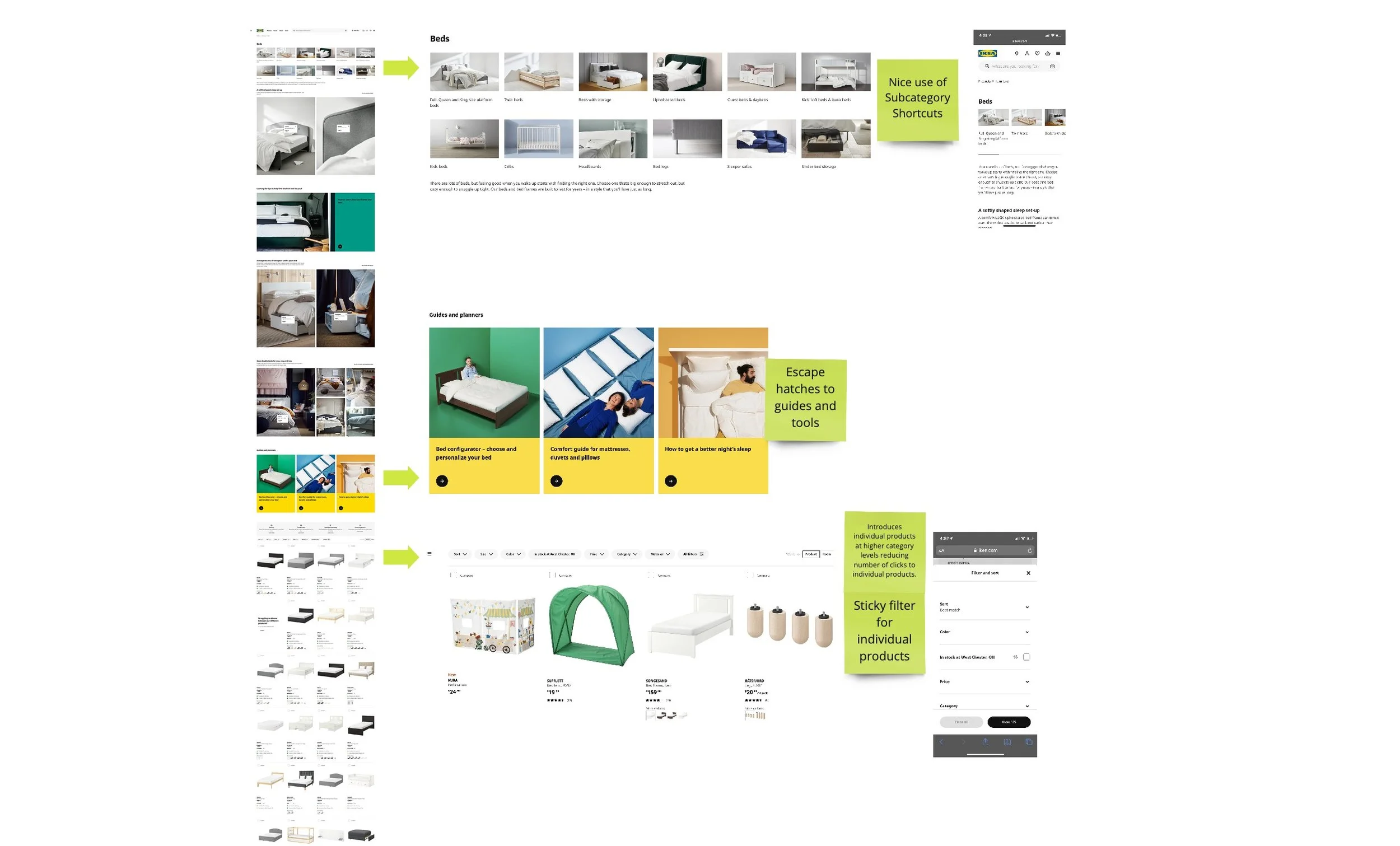
When researching direct competitors, we discovered that most experiences felt out of date. To find more modern solutions, I looked to furniture and hardware retailers as tangential research.
Similar to Tisch Scientific, retailers like IKEA and Home Depot share the following qualities:
Offer thousands of products with many subcategories
Purchase is dependent on meeting strict specifications and measurements
Offers similar products at different price ranges (private label and brand name) and promote discovery of these
THE PLAN
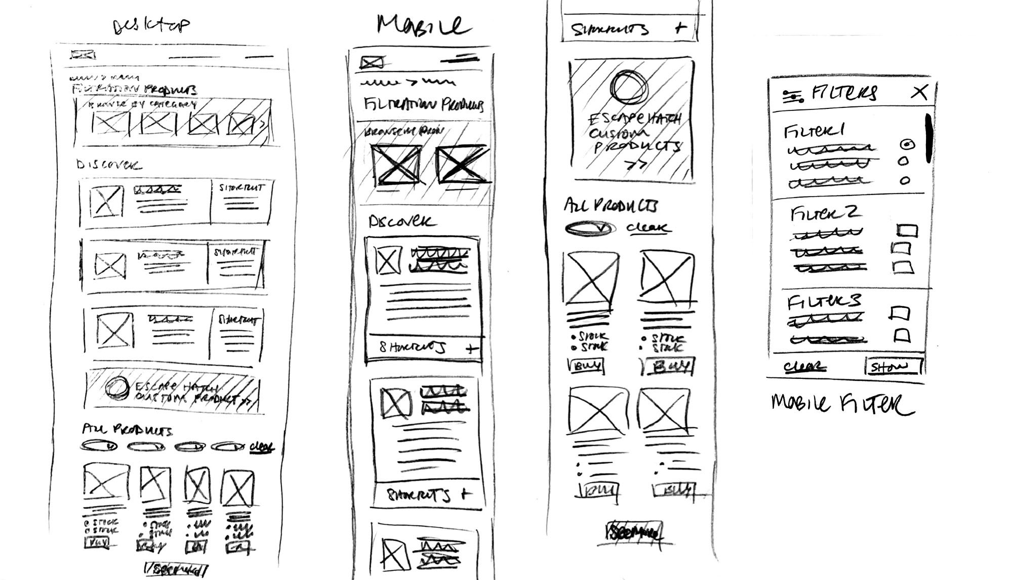
Because of the small team of contractors on this project, I was tasked to fly solo during wireframe and design development. I quickly sketched low-fidelity wireframe options to get a feel for how these new component ideas might fit together.
DESIGN & PROTOTYPE
So that these pages would not look out of place with other pages on site, the design system followed much of the same components as the current site.
Because these were decisions already aligned upon by all team members, I quickly moved into higher-fidelity prototyping.

“Julie thinks through every angle of a request. With every single project we worked on, she was somehow always able to exceed expectations typically in the first review. Julie not only brings out the best work in a team but pushes everyone around her to raise the bar on what is possible.”
Andrea L., Client
Next Case Studies
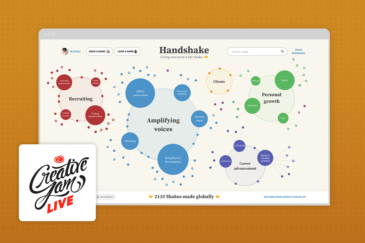
WORKSHOP • IDEATION • APP DESIGN • PROTOTYPE
Visionary DE&I solution for an agency network.
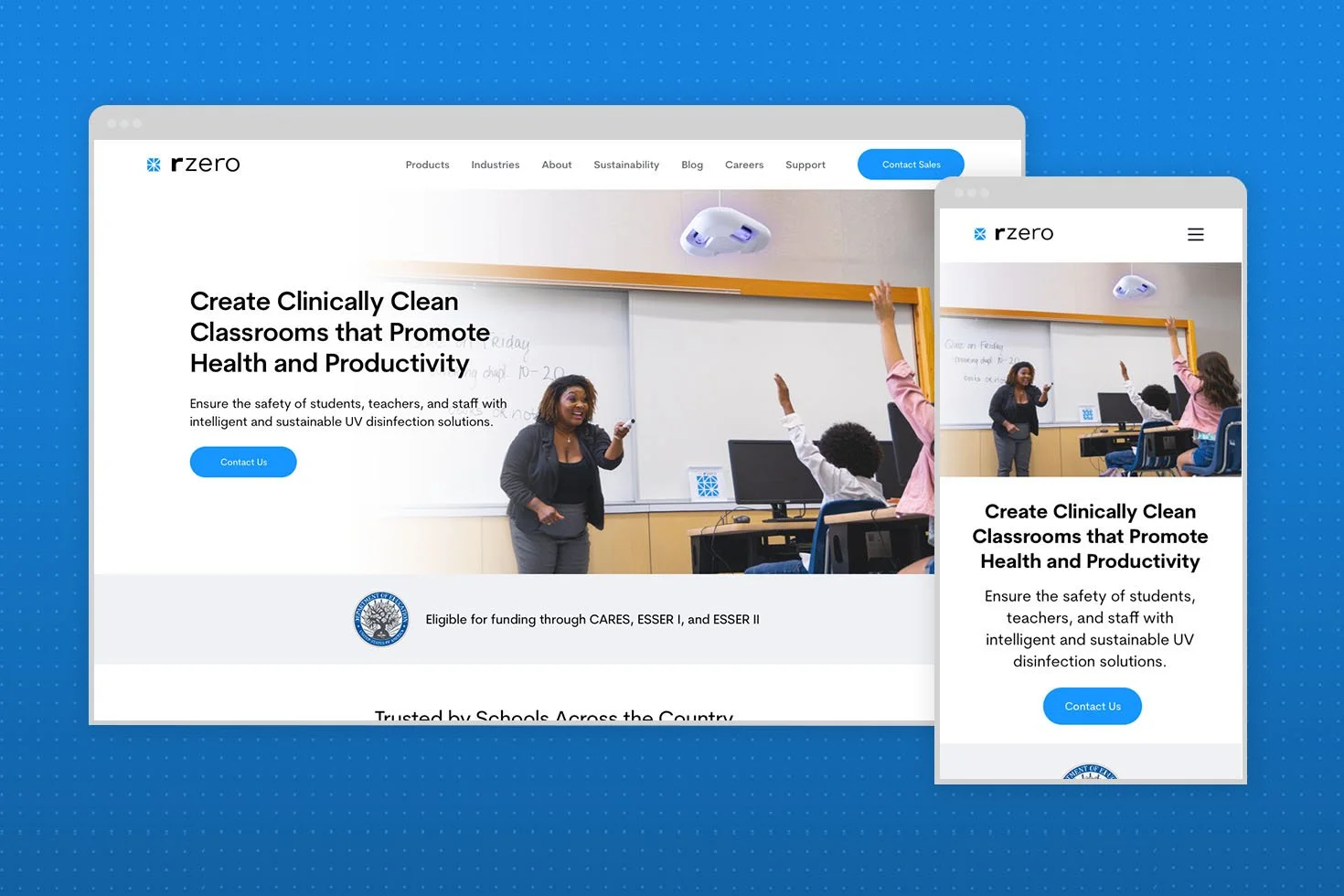
AGILE PROCESS • RESEARCH • STRATEGY • WIREFRAMES • WEB DESIGN
Bringing awareness to a new standard of health & safety.
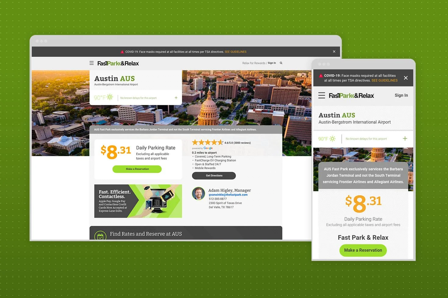
RESEARCH • TESTING STRATEGY • WEB DESIGN
Small, continuous updates drive big results.
